Hey there! Your shading is very beautiful and the accuracy on your Pokémon are top notch! Overall, the result is very tidy. I hope to see more logos from you, keep up the good work!

-
Welcome to Smeargle's Studio! Please be sure to review the studio rules. Feel also free to check out our hub to learn more about this place!Welcome to Smogon! Take a moment to read the Introduction to Smogon for a run-down on everything Smogon, and make sure you take some time to read the global rules.Congrats to the winners of the 2023 Smog Awards!
Zracknel's logo thread
- Thread starter Zracknel
- Start date
Many, many thanks to everyone who took the time to comment on the SPL logos-- I really appreciate your support (and critique)! It's been really awesome to see folks repping their teams, and I'm so glad you guys like the work :)
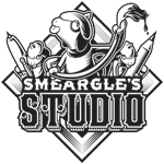
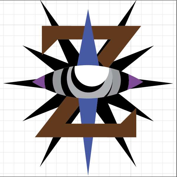
A long time ago, Alch asked me to do a logo for Smeargle's Studio
Today I'm happy to say that it's finally finished :)
This was a collab with the great and powerful nastyjungle:
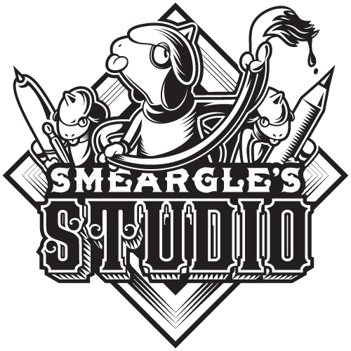
To explain a bit, much like the Battling 101 logo has the soul badge (or tutor badge) as a backdrop, so too does the smeargle's studio feature the plain badge (or artist badge)
I wanted to do something handcraft-y and woodcut-y for this logo rather than the cliche "smeargle's tail is painting the logo"
I sent Nastyjungle this empty diamond shape with typography:
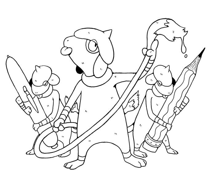
I asked nastyjungle draw a smeargle to be featured center stage
nastyjungle instead went above and beyond that and drew three smeargles:
As I was working, I started to feel that keeping things in straight black/white was more interesting than a thousand colors and gradients, so I went that route instead of my original plan:
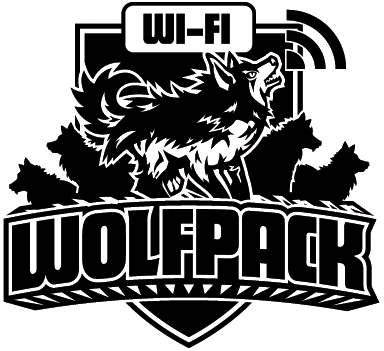
and that's how this logo came to be!
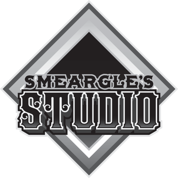
More sizes and some avatars and signatures:


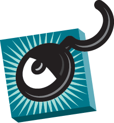
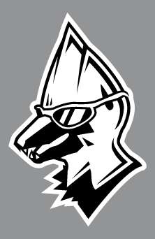
nastyjungle drew a raikou over my typography and control shape:

This was more than enough for me to go off of, so I fleshed raikou out in vector:
reading from right to left-- I felt that the logo was too tall, so I brought the pieces together until things became more square-like. The old control shape was scrapped in favor of something smaller, simpler and closer to the bottom of the logo for balance.

and that's how we arrived at the final version!
extra special thanks to nastyjungle for all of the help, the hard work, the late nights, and endless moral support. So strongth B) oh gonds it came out so good
the little details are my favorite
like the lines in the background are fat under the T and D and get skinny as they go down it looks so good and sexy
and the outlines around smeargle are so gooood ahrherhhg and so are the letters ahrhg i love the font that says studio so much the little curls you know how i feel about those already
and i really like that it isnt straight up b/w and actually a subtle brown tone
so attractive
these deets are so sexy
ahhhhh it came out so great i am so lucky to have opportunities to work with you big guy because you are the strongthest
just
so very BIG ZRACK Your typography just keeps getting better. I liked seeing the process too.
 Smeargle's Studio Supers, let's go!
Not that I'm any good.I finally get to do a legit "smog art bump," hooray :)
avatars for the arterview


I have been meaning to do this for eons... hopefully I can make time to do it soonIncredible stuff, Zrack. I know I'd love to see a full vector tutorial from you some time. Keep on rockin' the house ;)
This entire thing was a scheme to get an avatar out of you.
Kidding, of course; it was great to get you some zracknowledgement, as small as it may be.In a strange turn of events, I did something for myself: a new avatar

Sorry for the large images
Many logos for me start with scribbles like this:

The drawing is just to give an idea of where I want things to end; I don't trace sketches like these, especially not in a case like this where I know I want the finished thing to be crisp and regular and made of perfect shapes
Laying down the base shapes-- I have final colors in mind but just work in random high contrast colors so I can see what I am doing
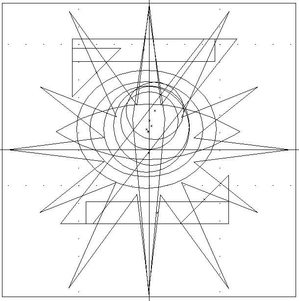
The above image in outline mode; note that the eye-shape is a mask over a series of concentric circles right now (so that I can get it to feel right without destroying my circles)
also note that literally everything here is built from a perfect shape... I do frequently draw bezier curves and use the pentool in illustrator, but in this case there was none of that, haha

more details added; I usually work side-by-side with a reference or references (the sketch in this case) so I can see what (if anything) is going wrong
started offsetting my paths. Everything is built from the foundation shapes in the previous screenshots. Here I know I want one of the crescent shapes on the eye to be asymmetrical, so I am trying to find where I should put that gray shape

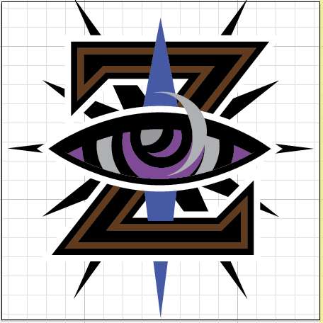
Things are starting to come together so I change the colors into something close to what they will be in the end. It's important not to do this too late in the process (I have learned this the hard way and been screwed over by color issues before). Lots of details added between this shot and the previous one, but they are all just more shape building and using illustrator's pathfinder tool
Here I thought I was finished... the last of the details are there and the logo has all the outlines I want it to have. If I was producing this logo for embroidery or printing, I would have ended here since all the colors and shapes are trapped nicely. But for the forums... it felt a little chunky to me, and I kind of liked the way it looked earlier without the extra outlines
So I cut away most of where the outlines were, making them transparent. In "the real world" this logo might be better because it could more easily become straight up black/white, but then again it would be pretty challenging to have this logo appear on a variety of colored backgrounds (because there aren't as many outlines protecting the colors)
I was also being a major scrub when making the transparent, but Nastyjungle showed me some tricks and saved the day. Thanks as always, nj :)
So obviously this wasn't a how-to, but this is probably the sort of thing you can expect when I actually do a how-to, haha
Thanks for reading :)You are awesome.One of the coolest things imo about working in vector is getting to produce artwork across a variety of mediums
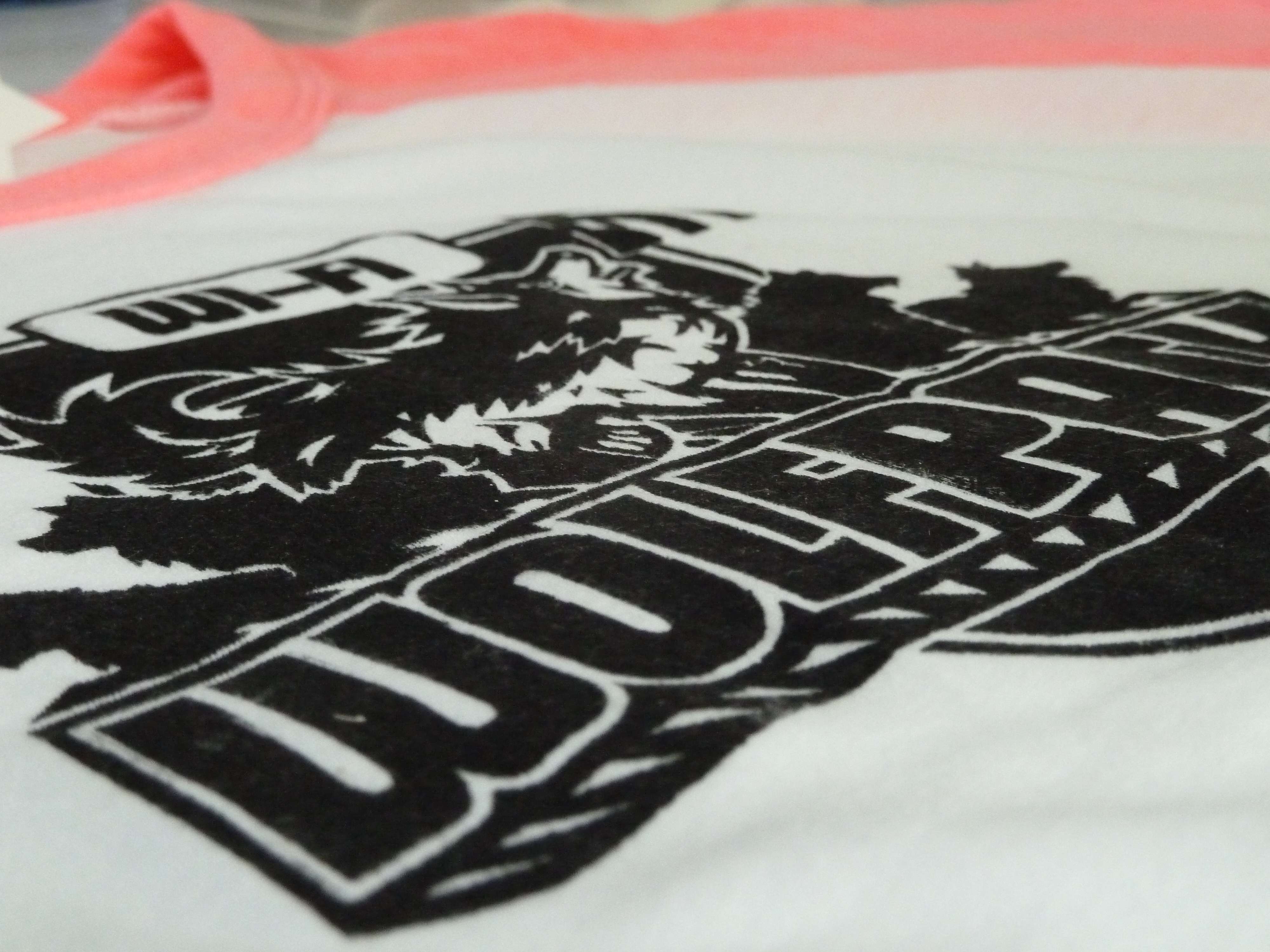
Today is Nastyjungle's birthday and I made some vector-based gifts!
The vector!
(water-based screen ink applied via thermofax screen and a sponge brush)

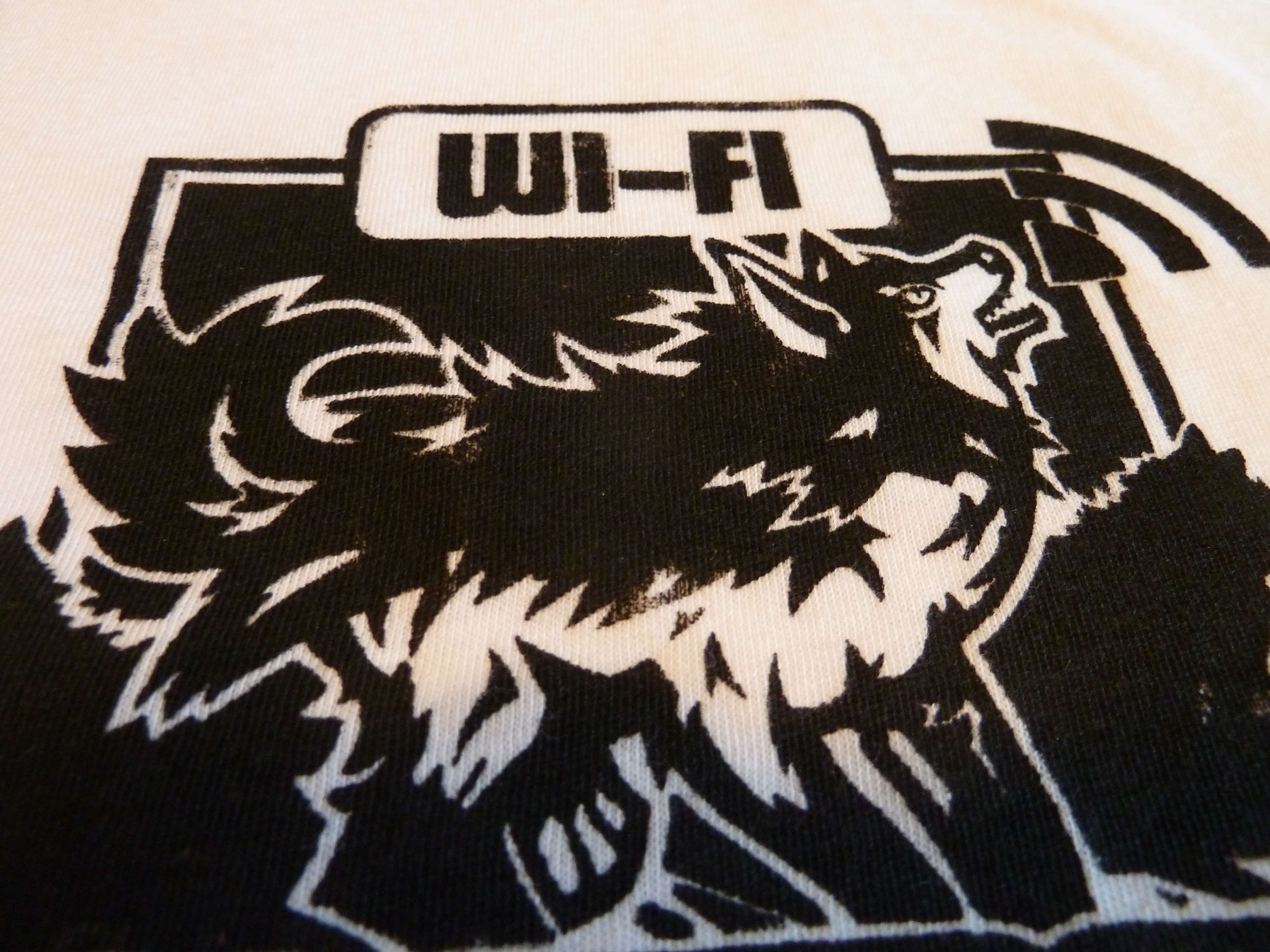
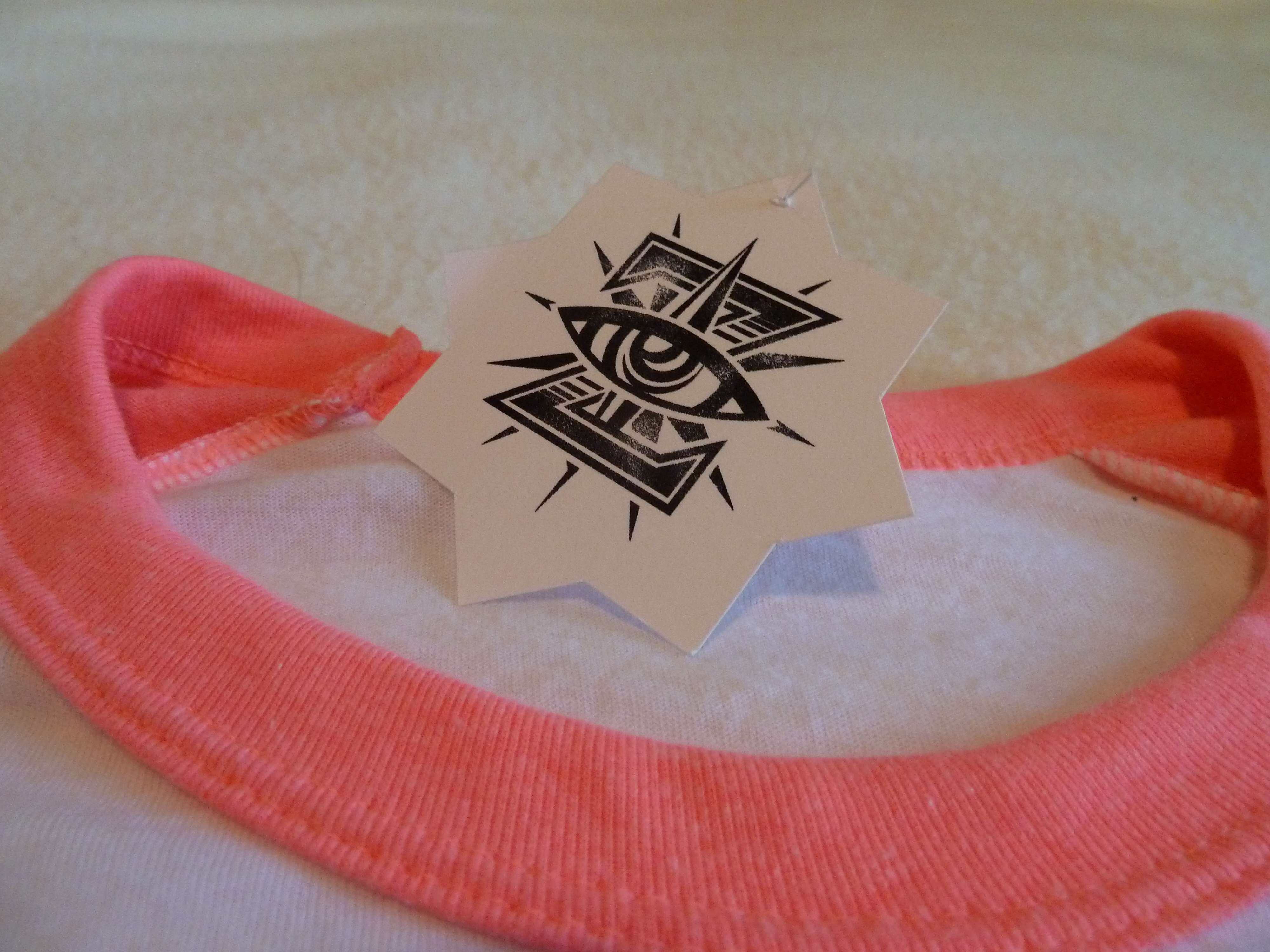
(Yes, this is my hangtag, haha. Putting that new logo to work!)
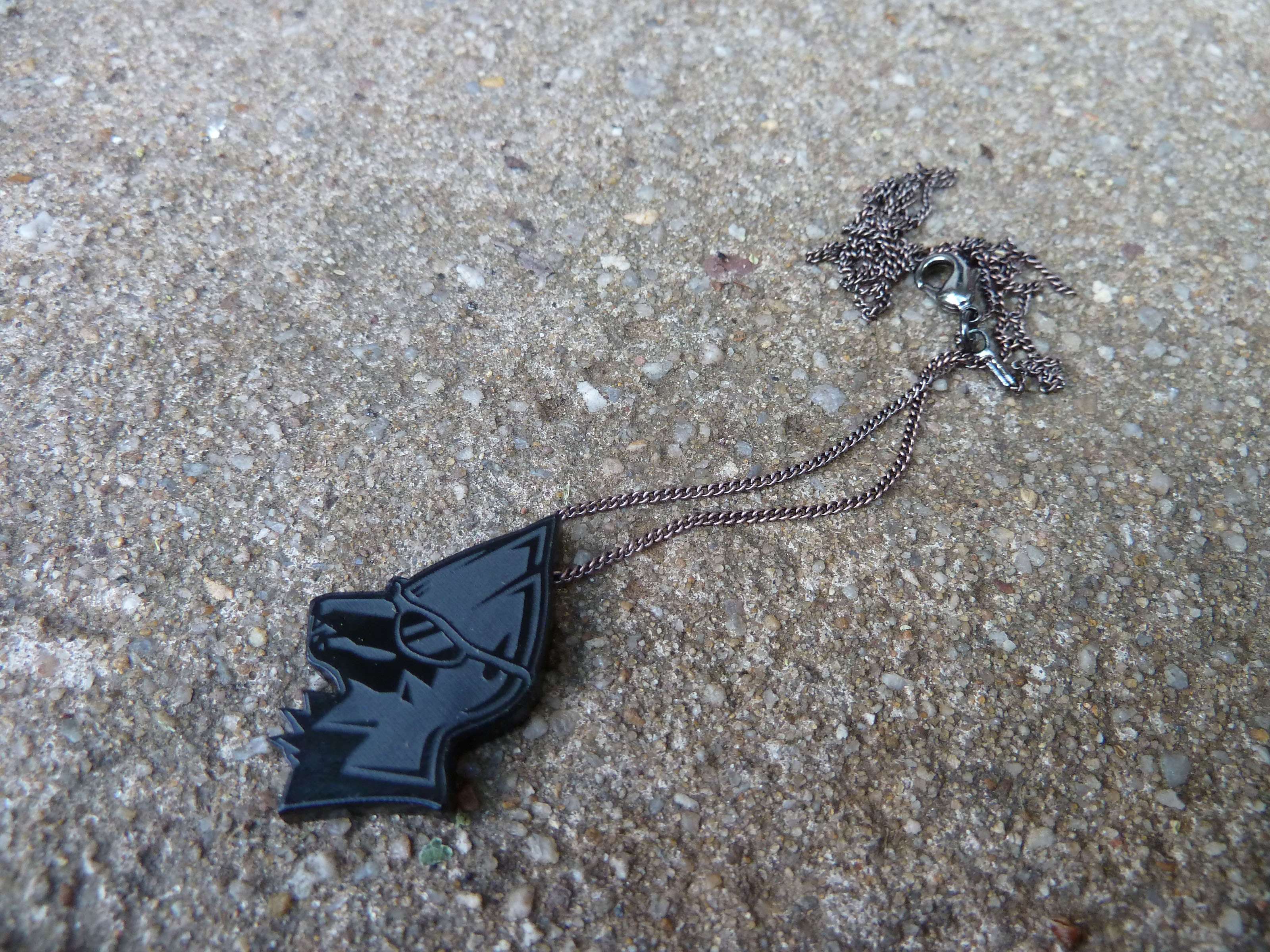
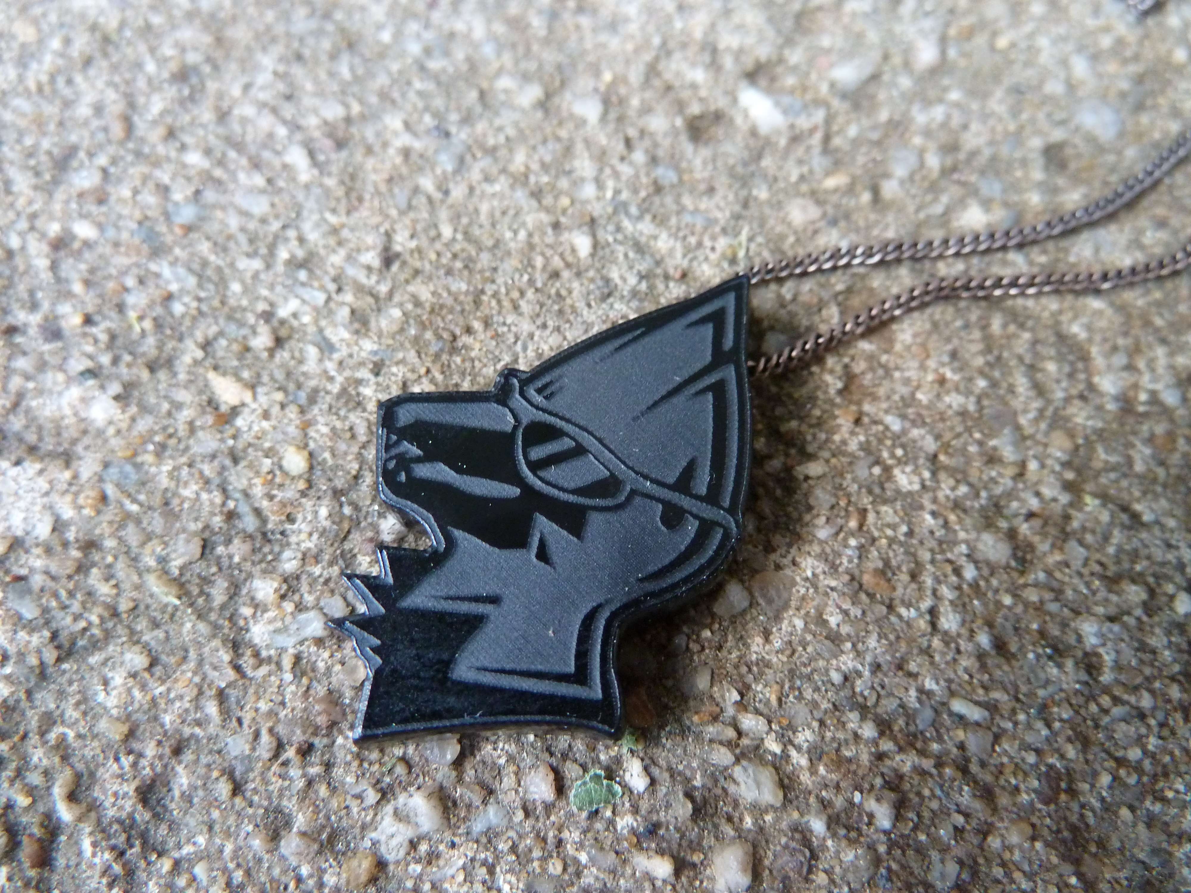
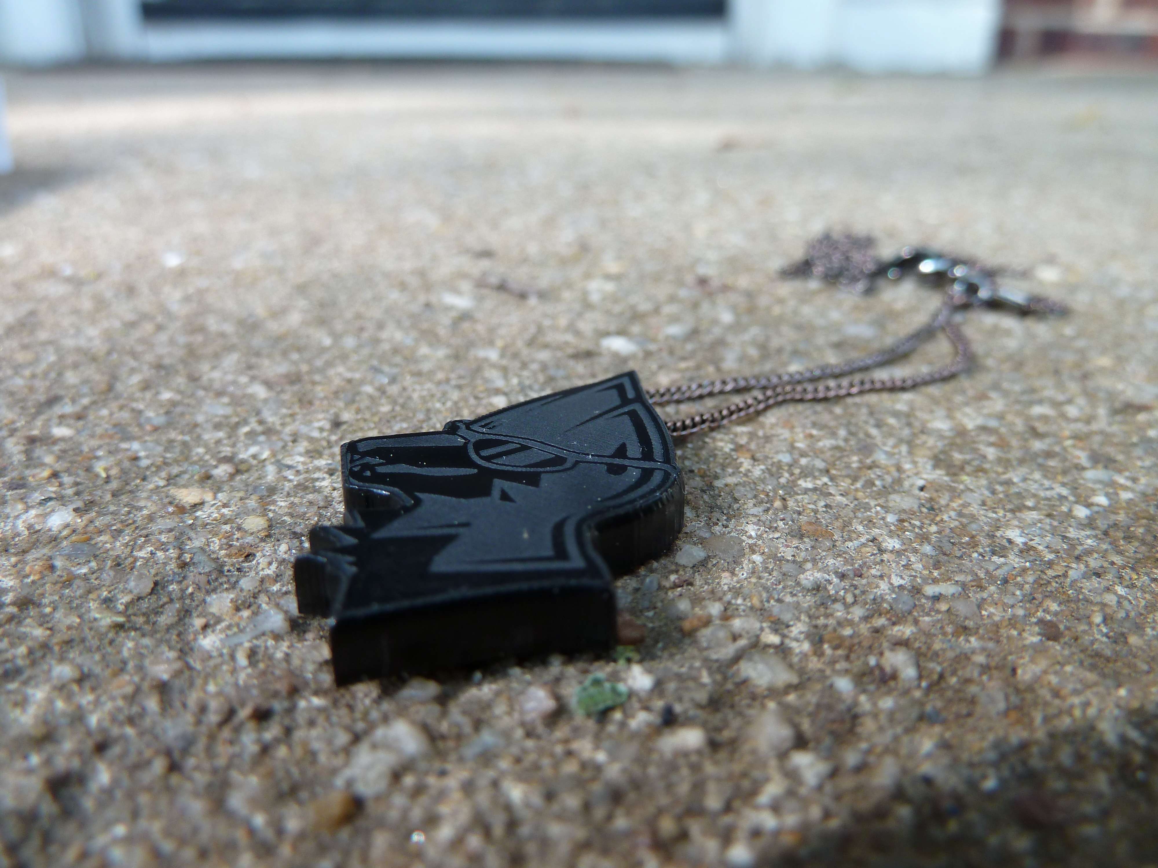
The vector!
(Laser-engraved acrylic plastic with plated copper chain. Pendant dimensions are 1.5" x 1" x 1/8")
HB courtney!!!
Nice to see you pull through on that note, even though it wasn't much. You seem to have a good knack for getting things organised as you only had that rough sketch to begin with.tutorial
And YES, vectors are definitely the raw material for cool shirt designs. I'd join a group for the sole purpose of wearing a shirt with their logo on.
big dawg B))))
haha so i already cooed about all of this stuff but i am happy to do it again!!
both the shirt and the necklace are majorly fucking cool, i love them to death
both are so much fun and i feel like a boss wearing ~~authentic zracknel merch~~
you are the best B) very cool for me to have such a good friend!
i appreciate it a great deal big man!!
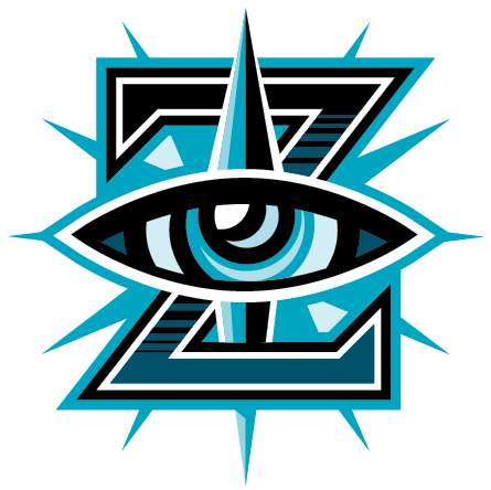
this post is incoherent as hell but whatever hahazracknel -- that shirt really is amazing, can i ask how you did it? to be honest i didn't understand what water-based screen ink, thermofax screen or sponge brush is -- i do some t shirt work so i'd be interested to know what your process is.Hooray! The competitor was finally released!
if you haven't yet, go check out the announcement to see what I'm talking about, and check out the competitor on the site to see what's new with smogon's tournament scene!
I did the logo for this portion of the site:
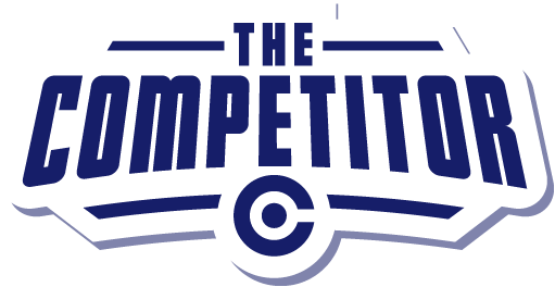
(I have a feeling this "C" pokeball design already exists somewhere out there in the world, so if it does please show me what else is currently using it)
I also did a news logo to tell you there's a news post:

I also did the layout design for the competitor. The final product was reached in small stages but this is one of the layout designs I pitched
I also did the background image for this part of the site. It's not the most exciting since it has some recycled artwork from the official smogon tournament, but it does have a new koffing in it as well.

Though on the minimal side, I think it makes a pretty decent desktop background. There are two versions, here and here. These images tile seamlessly vertically (although the final version on the site doesn't show this) so if anyone wants to see it smaller, just ask.
So hooray! It's released. Setsuna was the programmer/developer responsible for getting everything built and out there, so go thank him if you like it!
also I can't believe I didn't answer this
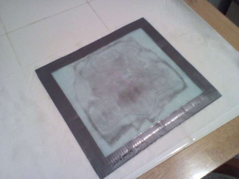
Pernicious said:zracknel -- that shirt really is amazing, can i ask how you did it? to be honest i didn't understand what water-based screen ink, thermofax screen or sponge brush is -- i do some t shirt work so i'd be interested to know what your process is.I bought a thermofax screen off of the internet with my design burned into it.
Here's what the screen looked like (after use; I didn't get any pictures before I used it):
I put this screen over top of a shirt I'd picked out, and used a sponge brush to apply the ink:

The result was a "screen-printed" t-shirt!
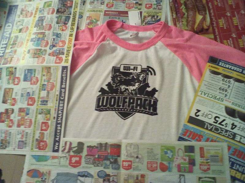
(Of course there was cardboard under the front of the shirt to make sure it didn't bleed through to the back!)
And that's how it went down! I encourage anyone who wants to do some very basic, low quantity shirt stuff to give this a shot, since it was very straightforward!Users Who Are Viewing This Thread (Users: 1, Guests: 0)
- ... and 1 more.


