Gen 3 certainly had some pretty iffy sprites, just like these ones:
 Sceptile deserved a far better sprite. It has an incredibly stiff and unoriginal pose, it doesn't seem to have claws on its feet but ball like toes instead (similar to Treecko), its head is way too big and its eyes just seem off to me.
 This thing just looks terrible. Nidoking's body is way too small on this one, the shading is lacking and that face... Fire Red and Leaf Green showed us how it should be like:
 Even Deoxys suffered from bad sprite syndrome. It lacks five fingers as it is shown in the original artwork, it looks way too skinny, even for a deoxys, its legs are way too short and its pose is just goofy in my opinion.
 God...where do I even begin with this one...Firstly, it has only four fingers as opposed of five from the original artwork and the later sprites similar to Deoxys, secondly, its eye looks (no pun intended) lazy, it doesn't seem to belong there and its pupil is too small and thirdly, it should have had darker colors. Speaking on darker colors...
These ones all needed to be darker colored:


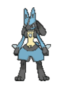
EXTRA SPRITE
 Just try staring at this thing. I guess they decided to go realistic with this one.


Oh, and the poses from both of them are unoriginal.


These ones all needed to be darker colored:


Gen 3 in my opinion had the worst sprites of any generation, they were just so lazy looking, yeah the gen 1 ones were also pretty bad but they had a lot of personality going for them as opposed to essentially every single gen 3 sprite.
EXTRA SPRITE

Last edited: