I don't think models "ruin" things nor do I find neutral postures much of a problem. Games before XY and games after XY have their own set of rules of what counts for good aesthetics or not, and trying to apply different standards from older gen, especially the static sprites to a newer gen is pretty unfair for the newer gen. Static sprites from older generations have to remain in one pose so the artists have to find out means to make this stance interesting, whereas 3D games have to contend with constant animations PLUS changing camera angles. It might be a reason some people complain about the "lack of charm". I guess some Pokemon transition poorly from 2D to 3D but sometimes it's attributed to the fault of aesthetic design as concept art for Pokemon tend to include a variety of angles, but other times, it's just how the camera is situated and won't be flattering to all Pokemon.
XY also has a dynamic camera if I'm correct, so they have to accommodate for this too. That default stance and angle we're posting and always seeing throughout Smogon doesn't really show the whole picture, so keep that in mind.
IMO anything from Black and White generation tends to look uglier than most models because the grided pixelated nature sprites just really aren't designed to withstand keyframing and rotations, so all the rotating stuff look all blurry and ugly.
So that out of the way, models that I agree look poor are attributed to a poor stance rather than off-model Pokemon. Also, the texture work for this game leaves A LOT to be desired. I've read some older post saying that it's a limitation of a render engine where textures are paled out to somehow accomodate for the lighting and what not, but I find it a rather unsatisfactory explanation as what causes a texture to appear the way it is usually is from diffuse (color) and materials (such as specular maps or metal maps) apply. I'm pretty sure Pokemon XY rendering engines aren't complex enough to seriously alter the textures where the diffuse has to be so washed out. It's more likely that the washed out diffuse textures come from a design aesthetic, but I don't quite understand that because it ends up altering the colors of all Pokemon prior to Pokemon XY, and that's really bad design as how a Pokemon is colored is really important to conveying one, on top of the shiny sprites.
Anyway, here's some bad ones.
I get that they're trying to go for a battle stance, but this is the only time where the tail looks so huge, it looks like a cypress. The tail just shouldn't be so high up like it, like it's some cat that got startled by the noise of a horse getting run over by a tractor, only to realize that's just Diagla's cry and it's just saying hello.
Gastrodon has always a pretty crappy shiny, but the washed out textures just make it even more difficult to tell. Yeah, that's Gastrodon's shiny. Also, I'm not really sure what's going on with Gastrodon's idle here. It looks like it's dazed after watching a distant Spinda teeter for way longer than healthy.
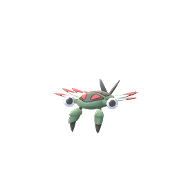
Arbok looks like it's trying to do the Egyptian dance or listening to the snake song. It's a funny idle, but not really suitable. You can say it looks like it's in motion, but it'll be like having a Blaziken jog in place or something. I don't think idling snakes normally do this.


The model isn't a good pose, but I blame camera shenanigans. The form is just lost on this one; you can't even really tell where the tail ends and you can't see the other side of its vest thing front sprite). The back sprite isn't good either, it has the same problem of the tail being all lazy like a plant that needs to be watered. Design-wise, this also took quite a hit. Notice the quality drop, the lost detail, of the leaves of the tip of its tail. It's baffling because they could've just went with a 2D plane with a transparent texture if acheiving a complex shape takes too many poly. Its "arms" also just look like max-revives squashed by a sitting Snorlax and was sewed on to this thing. This model is very bad overall, but at least its shiny somehow mostly avoids looking all washed out in the transition.


Kecleon looks like it just woke up after a dream that it was going to be viable for once and learned that Greninja exists. Why can't it get show off some occasional magic tricks and tongue taunting like back in Gen 3? Its color scheme is also garbage.
What the hell is this? It's like trying to make something like Ivysaur stand up again for no reason, but be all humanoid. But this is not the transition to 3D that made it all strange, it's whoever designed this stupid thing and gave us the wrong impression that it's supposed to be a cat-like Pokemon rather than some anthro fur baby. The anime and manga apparently show it on its hind legs too after a quick search from Bulbapedia, but I really don't see two completely different postures all that natural. Stick to one, please, but preferably the realistic one, not the weird humanoid thing.