
migzoo
new money
Hello friends,
Over two years ago, I authored this thread, which proposed using usage statistics to quantitatively measure the oft-used, otherwise hand-wavey concept of metagame balance, inspired by Doug's manifesto. This is much-delayed realization of my idea from two years ago, which I figured would be quite timely, given that we are currently in the transition between Generations 6 and 7.
In the last two years I have become less of a programming scrub, so I was able to write up a quick python script to compute various inequality/diversity metrics taken from the social sciences for a given usage statistics file. I originally proposed using the Gini coefficient, a popular measure of income inequality used in economics, the idea being that income inequality is analogous to imbalance. This time around, I also looked into diversity indices, which in theory should capture both balance and variety, as defined by Doug in his post, since "value of a diversity index increases both when the number of types increases and when evenness increases." In particular, I implemented
Anyways, here are some interesting findings and interpretations that I have come upon thus far:
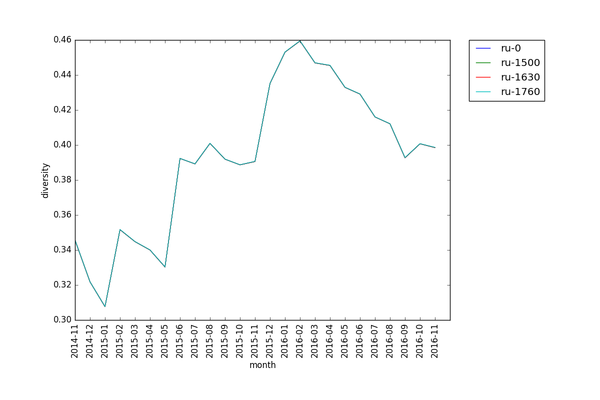
For reasons that I don't understand, diversity is remarkably stable across cutoffs for the same tier. Like in this plot here, you can barely even tell that there are multiple lines. This is true for all tiers that I've seen. Perhaps this means that diversity is a robust/good balance metric?
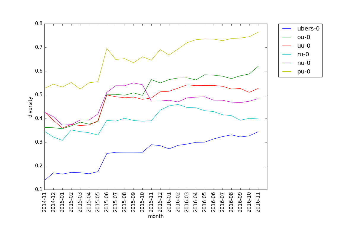
Here is the diversity plot for all the main tiers side-by-side (sans LC, I guess):
Some observations:
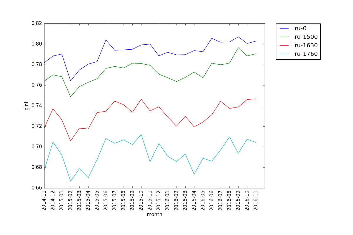
When looking at Gini coefficient, we see that the lines for different cutoffs of the same tier run roughly parallel, with 0 being the least "equal" and 1760 the most. This is somewhat counterintuitive, since players at lower cutoffs are prone to not know what they are doing and use random mons. Also, we can see that Gini tends to fluctuate more than diversity.
Here is the Gini plot for all the main tiers side-by-side, with cutoffs 0 and 1760 (1825 for OU):
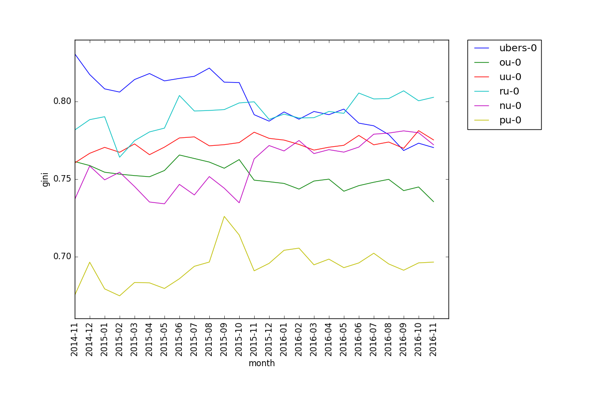
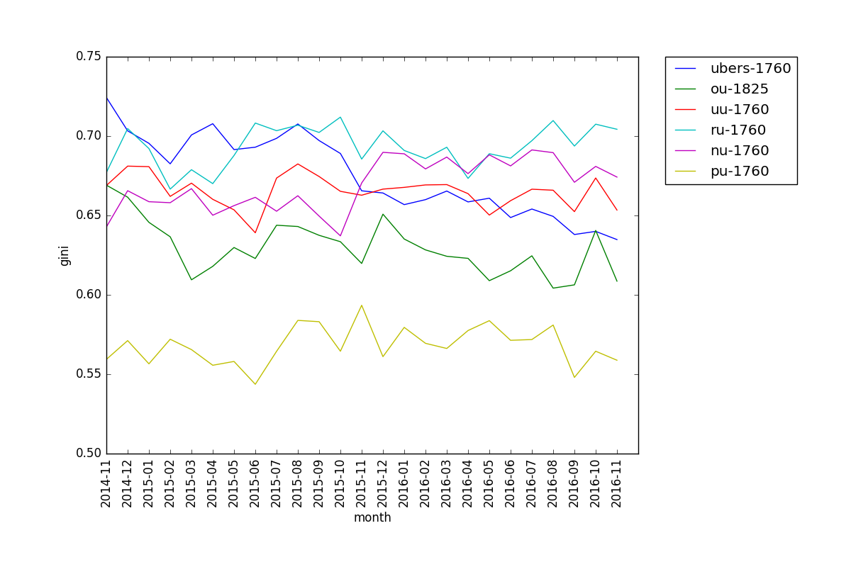
We can see that PU has the lowest Gini coefficient, which is consistent with the diversity plot. Interestingly, RU has had an even higher Gini coefficient than Ubers for a while now, despite Ubers having lower diversity.
I encourage anyone interested to poke around and try stuff on their own – I haven't looked at LC or past gens for example. The git repo for the project has steps to run; it should be pretty straightforward. If you have any feedback, suggestions, or interpretations of plots, those are all welcome as well.
Over two years ago, I authored this thread, which proposed using usage statistics to quantitatively measure the oft-used, otherwise hand-wavey concept of metagame balance, inspired by Doug's manifesto. This is much-delayed realization of my idea from two years ago, which I figured would be quite timely, given that we are currently in the transition between Generations 6 and 7.
In the last two years I have become less of a programming scrub, so I was able to write up a quick python script to compute various inequality/diversity metrics taken from the social sciences for a given usage statistics file. I originally proposed using the Gini coefficient, a popular measure of income inequality used in economics, the idea being that income inequality is analogous to imbalance. This time around, I also looked into diversity indices, which in theory should capture both balance and variety, as defined by Doug in his post, since "value of a diversity index increases both when the number of types increases and when evenness increases." In particular, I implemented
- Gini coefficient
- True diversity
- Richness
This most directly quantifies Doug's notion of "variety," since it "simply quantifies how many different types the dataset of interest contains." I propose using some epsilon minimum usage threshold when calculating richness to make it a more meaningful metric. - Shannon index
- Rényi entropy, Gini-Simpson index, Berger-Parker index
These are transformations of one of the above which I threw in for fun
Anyways, here are some interesting findings and interpretations that I have come upon thus far:

For reasons that I don't understand, diversity is remarkably stable across cutoffs for the same tier. Like in this plot here, you can barely even tell that there are multiple lines. This is true for all tiers that I've seen. Perhaps this means that diversity is a robust/good balance metric?
Here is the diversity plot for all the main tiers side-by-side (sans LC, I guess):

Some observations:
- All tiers seem to have a pretty steady upwards trend in diversity, except NU and RU, which decline/plateau in late 2015/early 2016 respectively. Idk if there is a good explanation for this, but one can interpret the upwards trend as suspect testing doing its intended job: balancing the metagame.
- Ubers is always the least diverse, and PU is always the most diverse, which is as expected.
- All tiers jump significantly in diversity between May and June of 2015. Again, I'm not sure why.

When looking at Gini coefficient, we see that the lines for different cutoffs of the same tier run roughly parallel, with 0 being the least "equal" and 1760 the most. This is somewhat counterintuitive, since players at lower cutoffs are prone to not know what they are doing and use random mons. Also, we can see that Gini tends to fluctuate more than diversity.
Here is the Gini plot for all the main tiers side-by-side, with cutoffs 0 and 1760 (1825 for OU):


We can see that PU has the lowest Gini coefficient, which is consistent with the diversity plot. Interestingly, RU has had an even higher Gini coefficient than Ubers for a while now, despite Ubers having lower diversity.
Richness, like diversity, is pretty much the same across different cutoffs for the same tier. What's somewhat interesting is the comparison of tiers for different values of epsilon:
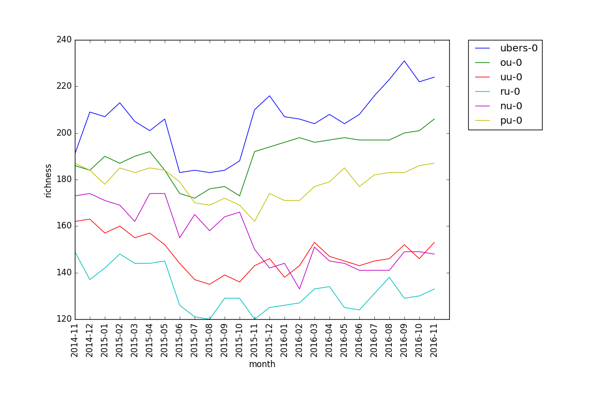
This is the plot for epsilon = 0.01, i.e. the number of pokemon with usage above 1% for each tier.
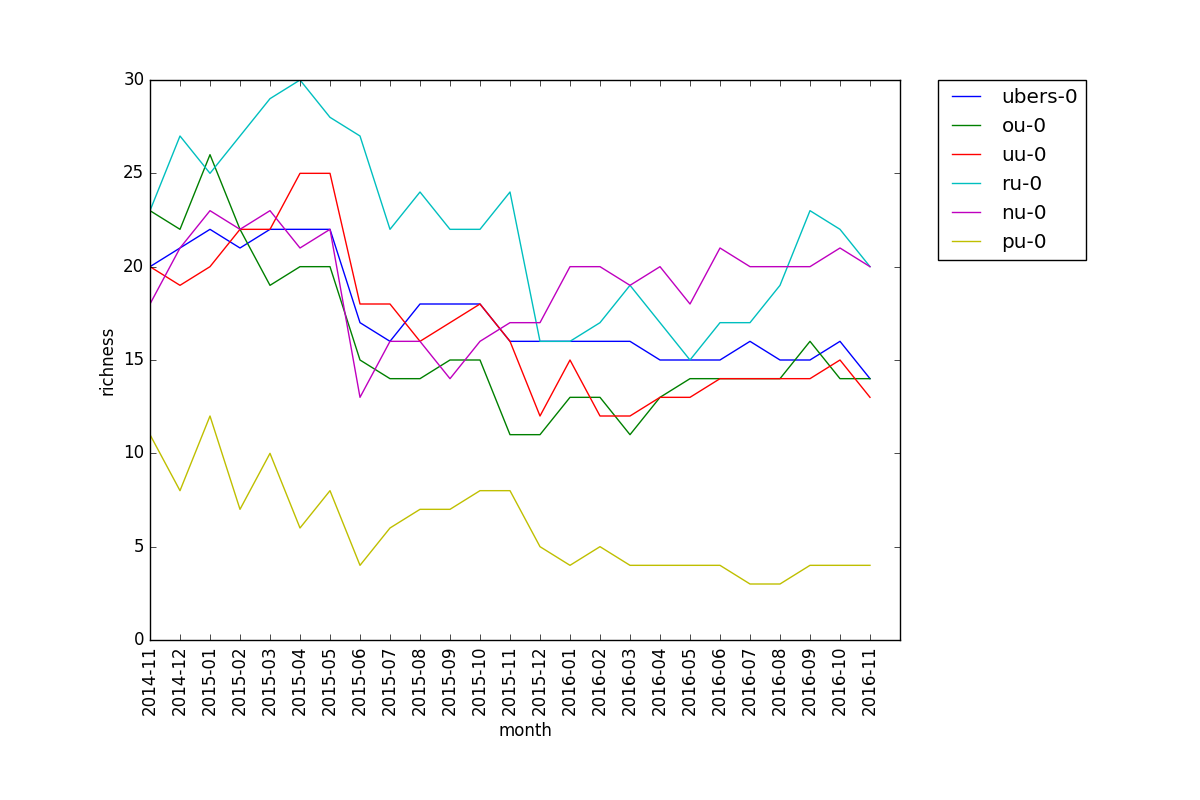
This is the plot for epsilon = 0.2, i.e. the number of pokemon with usage above 20% for each tier.
We see that Ubers has relatively high richness in the first plot, but is in the middle for the second. This suggests that there are a few highly viable pokemon, and a decent amount of somewhat viable ones. The fact that PU has very low richness in the second plot, i.e. there are few pokemon with high usage, makes sense since PU is a relatively undeveloped metagame with a lot of useless pokemon, so only a handful are known to be viable. Also, RU has the lowest richness in the first plot but one of the highest in the second. This suggests that there is a clear divide between the viable and unviable pokemon in the RU metagame.
I encourage anyone interested to poke around and try stuff on their own – I haven't looked at LC or past gens for example. The git repo for the project has steps to run; it should be pretty straightforward. If you have any feedback, suggestions, or interpretations of plots, those are all welcome as well.
