Judge A Pokémon: Wingin' It
| « Previous Article | Home | Next Article » |
Welcome to the 14th Judge-A-Pokémon! This time we go old school and return to Kanto and Johto, where we examine which bird really ruled the roost on the legendary ladder. Be prepared to take a trip back in time as we hopefully destroy each and every perception you ever had of Articuno, Moltres, Zapdos, Lugia, and Ho-Oh. Our panel this time consists of Danmire (represented by Houndoom), Antemortem (represented by Drifblim), and skylight (represented by Emboar), with a few words from RODAN (represented by Snorlax). Unfortunately, RODAN will be no longer writing for JAP after this issue; however, we have a replacement lined up which you'll find out next issue (which I'm sure you're mega excited for, correct?). The sky's the limit, and hopefully our panelists deliver as we return to Kanto and Johto!
Articuno
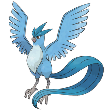

Of the three legendary birds of RBY, Articuno was my favourite as a child. A long flowing tail, nothing out of place, it was really pretty. Unfortunately, that's all it really is. It's pretty, and you might say its design is a work of art, but there's nothing that makes it stand out. Zapdos has the wow factor, Moltres has flames that kind of go everywhere and you can't miss it, whereas Articuno just has a neat design with nothing that really stands out. The monotone coloring also adds to its not standing out, whereas the other two birds have something that makes them more than just a pretty face (even though Moltres isn't exactly the best bird Pokémon of all time...).

Articuno is one of those Pokémon that you take a look at and say "simple." There is not much to offer on his its design, but you can tell right off the bat that it is an Ice-type. Its simplicity is what gives you the impression of a cold and mythical bird. The three-pointed crest on its head (something that its two brethren seem to borrow the theme of having something on their heads) are three dark feathers in the shape of ice crystals, making it look like some sort of crown—The Lord of Ice-types, if you will. One of the more notable things about Articuno is its long, stream-like tail, consisting of the same colors as its crest. The fact that every image or video of Articuno shows its tail doing some sort of calm, swaying movement gives off the appearance that it is more calm and serene. This adds on to its "royal" and "mythical" yet "simple" design. The bird's easy-on-the-eyes structure is one of my favorites of Generation 1, and if it was real, it would make for some breathtaking photographs.

Articuno has always been my personal favorite when it comes to the Legendary Bird trio, and it's no surprise that it has been included countless times in the main line games and not the other birds. I mean, the other birds have been, but we all know my main man Articuno has been the star of the show. Remember the observation deck in Fuchsia City? What Pokémon did you see flying in the distance through the scope? That's right, Articuno. Which bird is the only one with enough balls to not take flight in its sprite in Pokémon Platinum? That's right, Articuno. And have you seen its animation in Pokémon XD: Gale of Darkness? The thing has frost all around its wings. It's a tried and true badass to which none can hold a flame, metaphorically speaking. Its vibrant blue body is accented with a regal white tuft of fur on its chest—or is that a beard from the grace of the Duck Dynasty cast themselves?—as a true mark of its sovereignty, and a magnificent tail that puts every character from Pure to shame.
Zapdos
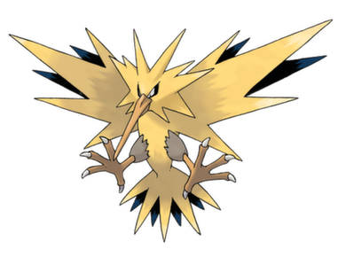
Zapdos is one of my boyfriend's favorite Pokémon and I can't really blame him. While it does seem to have the least effort put into its design (in terms of literally being like 13 triangles of various angles), it does look the coolest of the Kanto birds. I think the main reason for this is because the black on the other side of its wings contrasts so well with the yellow... because of this, the fan art of Zapdos is the best of all the birds. Combine bright lighting with black and yellow and you get literally the best special effects you can get in the sky. There is only one flaw with Zapdos, though. There is brown on a body that should otherwise be completely yellow, and this is not okay with me. It looks like a pile of dirt on a beautiful bird. Rest in peace, perfection.
When I think of electricity and power, I think of Zapdos. Its overall design expresses this. While it may look plain, the spiky feathers simplifies it. It sort of looks like as though a bird came too close to an electrical current and its feathers went up in a bunch from the static. Jokes aside, though, this is what I believe to be the fiercest of the three bird brethren. The black feathers on its back could be interpreted to heighten that fierceness, as black is a color often relating to death or wickedness.
Imagine Big Bird from Sesame Street, and imagine cocaine. Now imagine our loving Big Bird has succumbed to peer pressure and experimented with drugs one too many times. That's Zapdos. It has crazed, sunken eyes, ragged wings, and overgrown talons—it's got all the signs of an addict. Call it the problem child of the bunch. Articuno and eldest sibling Moltres were never able to tame the beast and thus its life spun wildly out of control. There was no hope for it after high school graduation, so it turned to a rogue life and took shelter in abandoned locations such as power plants. Truly, Zapdos doesn't seem like it even belongs with the other Kanto birds because it lacks any and all elegance or finesse and could seemingly father the bastard yellow Angry Bird children. Despite Zapdos's likeness to an emo 6th grader, it's a rather cool Pokémon otherwise, what with it literally controlling electricity and dropping thunderbolts on your head more often than Zeus himself.
Moltres

I never really liked Moltres or Rapidash, yet I loved Ponyta, because it was the perfect balance of flames and body. The other two didn't get it quite right. Rapidash's flames look unbelievable—but enough about Rapidash, we're here for Moltres, right? Moltres's flames also look unbelievable, but to a lesser extent. This is probably because, for some crazy reason, I associate it with a water bird, like, a goose, a duck, something along those lines. And as we know, water does not mix well with fire, and therefore it seems illogical to have flames hanging off the side of what should belong in water. Despite that, Moltres has an okay design, but it pales considerably compared to Zapdos, which is considerably more badass.
The last of the three legendary birds, this one needs no introduction on what mythology it is based on. Having a phoenix-oriented theme, this bird sports fire-like plumage on both its head and wings, while having a flowing fire-like tail. Fire is often associated with life, energy, and destruction, but again, this bird takes a more "regal" approach. Most of its art doesn't make it look scary compared to Zapdos, so it could be more of a polar opposite to Articuno's icy-flow, design wise, but keeping the overall "calm flow." Moltres may be pretty obvious on its inspiration, but I don't have anything against the bird.
Moltres has been a blessing to low income households for years and... Wait, are you telling me it's not a chicken? If not for this being a children's game, Moltres would literally be fried chicken. What even is Moltres, though? I'd venture to say a flaming swan, but then most swans have the least bit of tangible grace. Then again, someone cast Natalie Portman in Black Swan. Nobody's perfect.
Ho-Oh
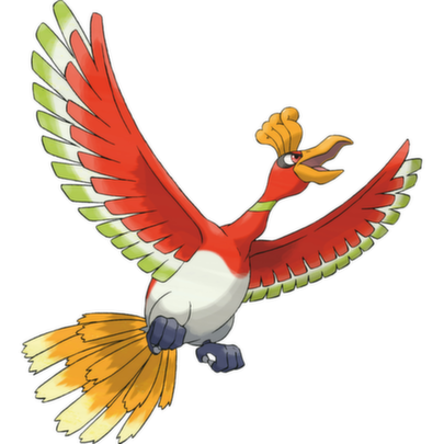
Ho-Oh was designed so well that I couldn't tell that it looked a lot like a flying turkey until I was in my 20s. Wait... or was that a peacock? I don't know, but it was definitely deceiving to me at first. As a kid, I was in love with Ho-Oh; I thought it was literally the best-designed legendary ever (until I took a glance at Entei and realized I was so very wrong). But in reality... it isn't really. There are only a few poses that Ho-Oh looks good in, which is the Dream World art. Any other pose is pretty much inferior to Fearow. When you look at it from the back, you kind of (again lol) wonder if its feathers at the back have been burnt off or never really grew in the first place. A majestic bird is meant to have long flowing feathers and Ho-Oh's just sit there, pretty much like a broom. Actually, if you grabbed a hold of its head, you could use it as a broom... or for Thanksgiving dinner, but we don't really want Team Plasma involved now, do we? The rest of Ho-Oh is okay, but it feels like its design would flow better if it didn't have the random white coloring underneath, and didn't have green on its feathers at all. I wouldn't mind the white if the green was removed, since the green makes it look less like a phoenix, which it's meant to be based around. Other than that, though, I don't really mind its design; for a legendary it's pretty cool and they could've done a lot worse, so no complaints here!
Now we're moving to the big boys. While I have said "regal" maybe twice in this run down, Ho-Oh takes the cake for the definition of this word. Seen flying near rainbows, symbols of hope and peace, this magnificent-looking bird has bright plumage of red, white and light green. Its two most noticeable features for me are the bright yellow plumage on its tail and the "crown" sitting on his head. The crown of yellow feathers gives this very God-esque like feel to Ho-Oh. Known for its Legend of resurrecting the three fallen Pokémon, this adds on to the design. A very noble and royal looking Pokémon, Ho-Oh is on my list of favorite Pokémon.
Ho-Oh isn't known as The the Pokémon for nothing. Its entire body is a dazzling array of the most stunning colors, resembling a rainbow if you put your imagination to it. Unfortunately, Ho-Oh's actual body resembles that of a fat chicken—or is that a turkey?—and it's not at all charming. Its neck cranes out at an uncomfortable looking angle from its body in most of its art, and while wings should naturally be rather flexible, notice that Ho-Oh's are practically made of rubber. Thankfully for the bird, the mesmerizing display that the wings radiate with are a saving grace to a Pokémon that is otherwise no more than a Thanksgiving delicacy.

I am quite the Ho-Oh fan if I could say so myself. I have always preferred the prettiness and elegance that this honkin bird brings as opposed to the shitass Lugia. Ho-Oh has so much about its design that screams "I AM VERY IMPORTANT. ALSO I'M BEAUTIFUL NO MATTER WHAT YOU SAY. STEALTH ROCK CAN'T BRING ME DOWN." Not only is it absolutely gorgeous to the eye, but it also rocks a lot in the battlefield (crippling Stealth Rock weakness aside). Regenerator is a neat ability that ties into its phoenix aesthetic. It also has the meanest eyes in Pokémon. They will pierce you so deeply that you will need a large band-aid. TL;DR Ho-Oh > Lugia.
Lugia

When I think of Lugia, I get all nostalgic because it was from the movie Pokémon 2000, it was Silver, it was my childhood. While this is lovely and all, nostalgia has shielded me from how badly designed Lugia actually is. For one, I thought it was actually Water- / Flying-type, because it rules the sea. What other reason do you need? But no, 10 years later I discovered it was part Psychic instead of Water. Way to be deceiving, Lugia. In regards to visual design, I don't really get why it has giant flaps for arms. I mean, I don't see how else they could've designed its arms, but they're just so huge and it looks like it'd be a struggle to move them each time. Combine that with huge feet and Lugia seems like it has a rough time doing anything other than flying. I love its face though; it kind of reminds me of a masquerade ball with those purple spikes on its face, which makes me wonder what it's hiding underneath. The last prominent thing about Lugia's design is that it looks a lot like a plane, which leads me to wonder why we don't have planes that look like Lugia. I guess life will just be plane until that really is possible.
Finishing off with the Guardian of the Seas, Lugia sports a design that is very similar to that of sea monsters. Having only two representative colors is all the Pokémon really needs to show that it is a force not to be trifled with. The simplicity of its colors give off a feel of its enormousness, as well as its giant wingspan. The scales around its eyes are very intimidating, adding to that "monster" look. More dangerous-looking than its more sky-bound brother, Ho-Oh, Lugia's gigantic stature is a terror in the depths, only rivaled by that of another Sea Guardian.
Lugia has so much going on for it, yet nothing at all. Why is part of its skin sticking out? What are those horn-like things at the end of its tail? And who the hell approved of its winged eyeliner? There's many questionable fashion choices on the so-called "guardian of the sea", and you'd think a being bearing such a prestigious title would hire better advisers. Alas, Lugia is the victim of circumstance and has arguably one of the worst designs out of all the Pokémon featured in this article. In fact, it's even got one of the worst and most confusing type combinations. I'll take Water / Flying for 800, Alex. No? Generation II really missed out, because it even could have opted for a sweet dual Dragon typing to compliment those wicked exterior designs. Instead, it'll have to settle for every flap of its wings destroying everything it loves and causing 40-day storms. Rather charming, if you ask me.
| « Previous Article | Home | Next Article » |