Smeargle's Studio Update
| « Previous Article | Home | Next Article » |
Introduction
Hello Smogonites! With Smeargle's Studio showing above-average activity for quite some time, we're finally featuring this update article for three issues in a row! Many things here should be familiar—another Monthly Art Contest is complete, with Bummer's suggestion of "minimalism" being the theme here. Furthermore, there has been an influx of new people lately and we're going to introduce some of these new and upcoming artists with their spectacular work. Last but not least, Eagle4 has restarted an old contest, the Extreme Pokémon Makeover Contest, and I'm sure you'd like to see the creative and witty designs that the judges have deemed to be the top!
Contests
MAC #22 – Minimalism
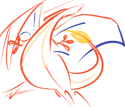
1st place – CBMeadow
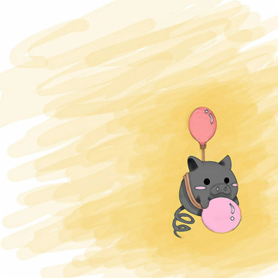
2nd place – Cheeno
With a simplistic representation, CBMeadow pulls off a Charizard piece by only drawing the outline in swift strokes. Each part of the Charizard is drawn with their respective colors, adding some recognizable features. Despite none of the lines being refined, CBMeadow is still able to show well-defined shapes in order to stay within the theme of minimalism. My favorite part of her piece is the pose—it looks really dynamic despite the piece showing minimal detail in general. I can see why it's a favorite among the Smeargle's Studio regulars.
In a modest second place is Cheeno's Spoink piece. I personally don't think that it's the most fitting representation of minimalism, unless you consider the lack of a composed background to be a representation of minimalism, but I really like the piece in general. The concept is a slightly humorous twist on the idiom "when pigs fly" by having Spoink tied to a balloon while floating in space. The simplistic expression that Spoink has while holding its pearl makes it look adorable—that's most likely why everyone was captivated by this piece. This is another great entry for this contest because it's simplistic and straight to the point, so congratulations to Cheeno!
Extreme Pokémon Makeover Contest
And here we have an old project, originally started by Hipmonlee, that aims to take a Pokémon line and create a better representation of it based on the original concept. Eagle4, who restarted this project, eventually decided to allow artists to create redesigns for Regirock, Regice, and Registeel after much deliberation. In the end, it was Doran Dragon who won, with Bummer taking a comfortable second place. The entire contest thread can be found here, but meanwhile, here are the winning pieces, as well as some of the judges' commentary!
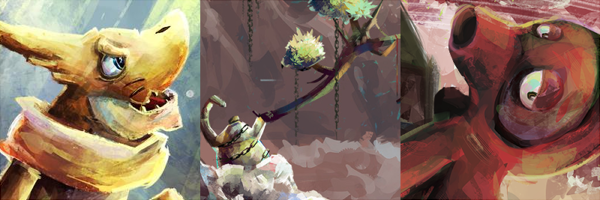
1st Place – Doran Dragon

I must say that you've pulled off the Regis' concepts off very well while keeping a distinction between each design. They look like humanoid golems that aren't just hunks of their respective elements. Each design has its own story to it, from the past to the current-/future-inspired ones, while keeping the original concept intact. You've done very nicely in terms of technicalities—no significant faults I can say. I applaud your thought process and subsequent creations.
Overall: 9/10
—Quanyails
Your Regice is pretty cool. I like where you went with the design with an overcoat that resembles something an eskimo would wear. Registeel is almost as cool, but I kept help but envision its torso as intestines with how they are coiled. All of these can be summed up by your Regirock, creative design, but somewhat lacking in closer details. You didn't make them totally conform to their elemental type, which makes them stand out from the actual designs.
********
—Kevin Garrett
These guys are wonderful. Each has it's own features, yet keeps true to the theme, which I find excellent. I like your use of contrasting colours; it makes the original Regis look dull in comparison. I do agree with Kevin that the torso of your Registeel looks a little odd, but that's just a slight nitpick in an otherwise fantastic entry.
9/10
—Eagle4
2nd Place – Bummer
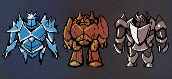
These are really polished. The first thing that stands out to me is how you substituted the standard dots for helmet customization. Not only does it work well with your knight theme, but it also allows you to play up their type while staying true to the originals. The armor for each of your designs appropriately distinguishes between each of the trio. The only thing I can criticize is how they play out much the same way as the original designs. While they might not be the most typical looking Pokémon, they were well done in their execution.
*********
—Kevin Garrett
You've chosen a great theme to base your Regis on, as it still relates to the original. golem-esque theme. I love each and (almost) every detail of your Pokémon, ranging from the differing helmets, to the impressive and well-chosen claws, these are all well thought-out. I am especially fond of Regice's shoulder armour, but I see the legs a little too thin; I don't see how it could hold the upperbody's weight. I do think however, that these Pokémon are in desperate need of a secondary colour; they look great, accomplished and... plain.
8/10
—Eagle4
Hmm, knights. o3o A bit uninspired is what I first think, but that is from my thoughts on Aurumoth's pre-evolutions and the Vanillite line redesign. Instead, I think you've done a nice job using that concept with the Regis. They all fit together nicely as a trio of knights—each of them share the same proportions while having distinct differences to showcase their respective typings. I do like the different ‘armor' each of the Regis bears--it gives a sense of difference to each of them while having a thread throughout. I thought of the sharp lines of Regice, the rounded curves of Regirocks, and the mingling of the two of Registeel as being reminiscent of their defensive stats. I don't think that you intended that, but it's a neat comparison.
The qualm I have for your design is the choice of monotone for each design. Granted, Regice isn't the most colorful Pokémon out there, but removing the yellow from the dots that represent its eyes makes it a plain blue with lights and darks. Registeel does have two choices of color, but there remains a lack of contrast. The ideas are nice and the lines are nice, but it lacks just slightly in the color compartment.
Overall: 7/10
—Quanyails
Smogon's New and Upcoming Artists
ZapDraws

ZapDraws is incredibly masterful in getting certain details down, despite his work being relatively simple. His strength lies in his cartooning—the exaggerated appearances, the blown-out proportions, and the whimsical facial expressions are what makes his work absolutely stellar. In addition, the linework is extremely detailed, the colors are bold and vibrant, and the shading and highlights are just spot on. Although one may not notice it as much, the backgrounds that ZapDraws... draws... are really colorful and enticing. It just gives more of a reason for you to say "wow!" whenever you see his work. And to top it all off, ZapDraws has been a huge contributor to Smogon from the get-go, contributing to the Smeargle Card Project and articles for The Smog. Everything I'm saying here is really just an understatement of ZapDraws's art, so why not just check it out for yourself over here? You'll be amazed.
sharkstache
sharkstache has really shown a beautiful array of work ever since he stepped into Smeargle's Studio at Smogon. His digital paintings are absolutely stellar, and they show intricate details in the scenery and shading. The colors in his work may sometimes seem a little dark and drab, but they still collectively make up a colorful and harmonious palette that just makes each piece look wonderful. That just goes to show that it doesn't matter (too much) what colors you start out with as long as you manage to blend them and achieve color harmony. The brush he tends to use often creates a neat texture/effect that really emphasizes the highlights and shades in the Pokémon that sharkstache draws. It's truly great, so be sure to check out his art thread here!
| « Previous Article | Home | Next Article » |